
Client
chi’s toast
Industry
Service/Food
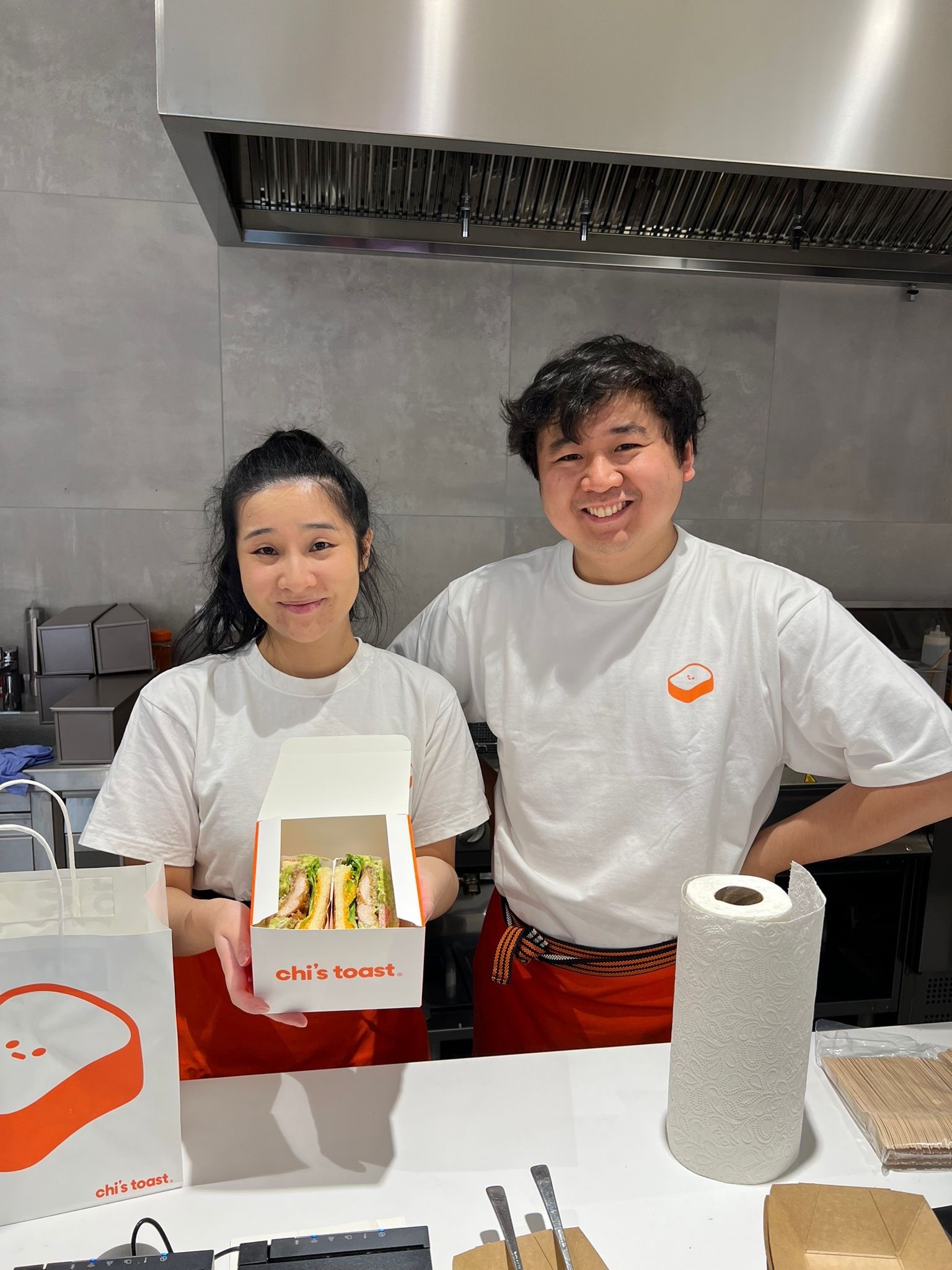
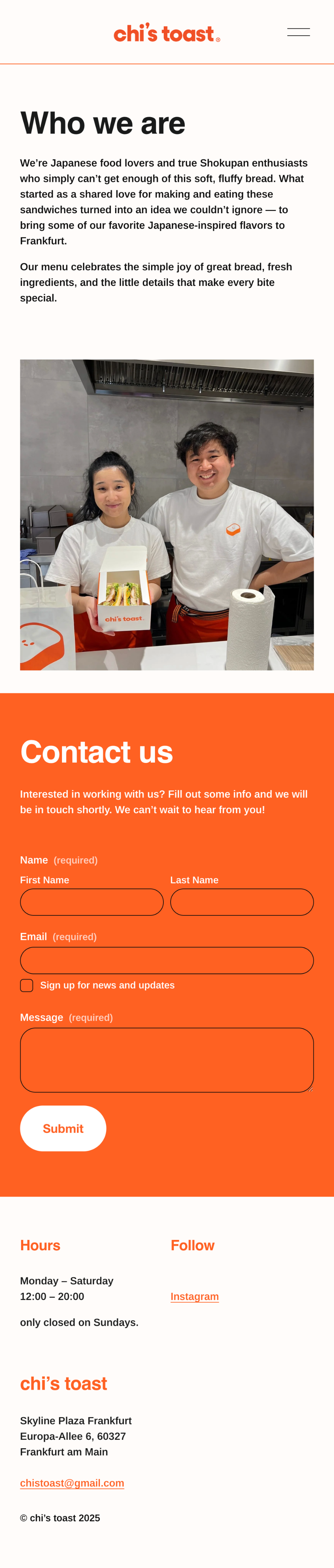
The creators of chi’s toast reached out to me looking for help initially with creating a logo, which later expanded to working together on their packaging, website, store interior, and more.
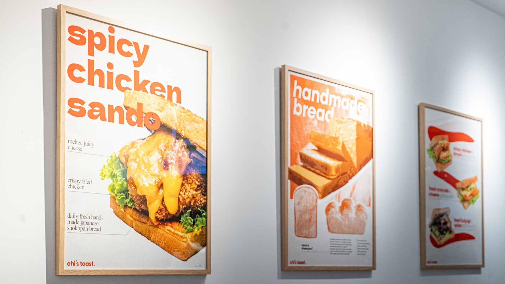
With Japanese Shokupan at the center and being located in a shopping mall with a lot of foot traffic, chi’s toast was looking for a brand identity that conveys an elevated fast-food take-out vibe, while keeping the Japanese core identity.
chi’s toast のクリエイターから、最初はロゴ制作のご相談をいただきました。その後、パッケージ、ウェブサイト、店舗の内装などへと仕事の範囲が広がり、ブランド全体を一緒につくっていく形になりました。
日本の食パンを中心に据え、人通りの多いショッピングモール内に店舗を構える chi’s toast には、「少し上質なファストフードのテイクアウト」という雰囲気を持ちながらも、日本らしいコアのアイデンティティをきちんと保てるブランドづくりが求められていました。
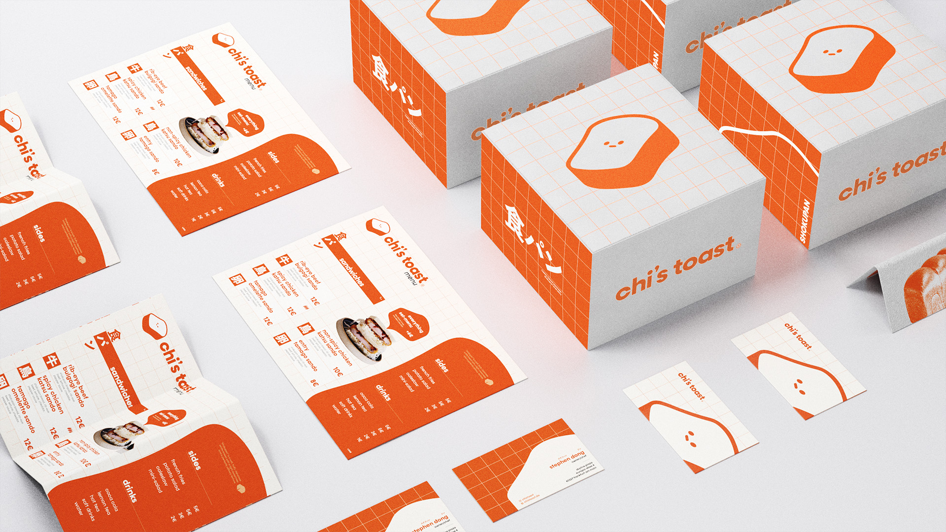
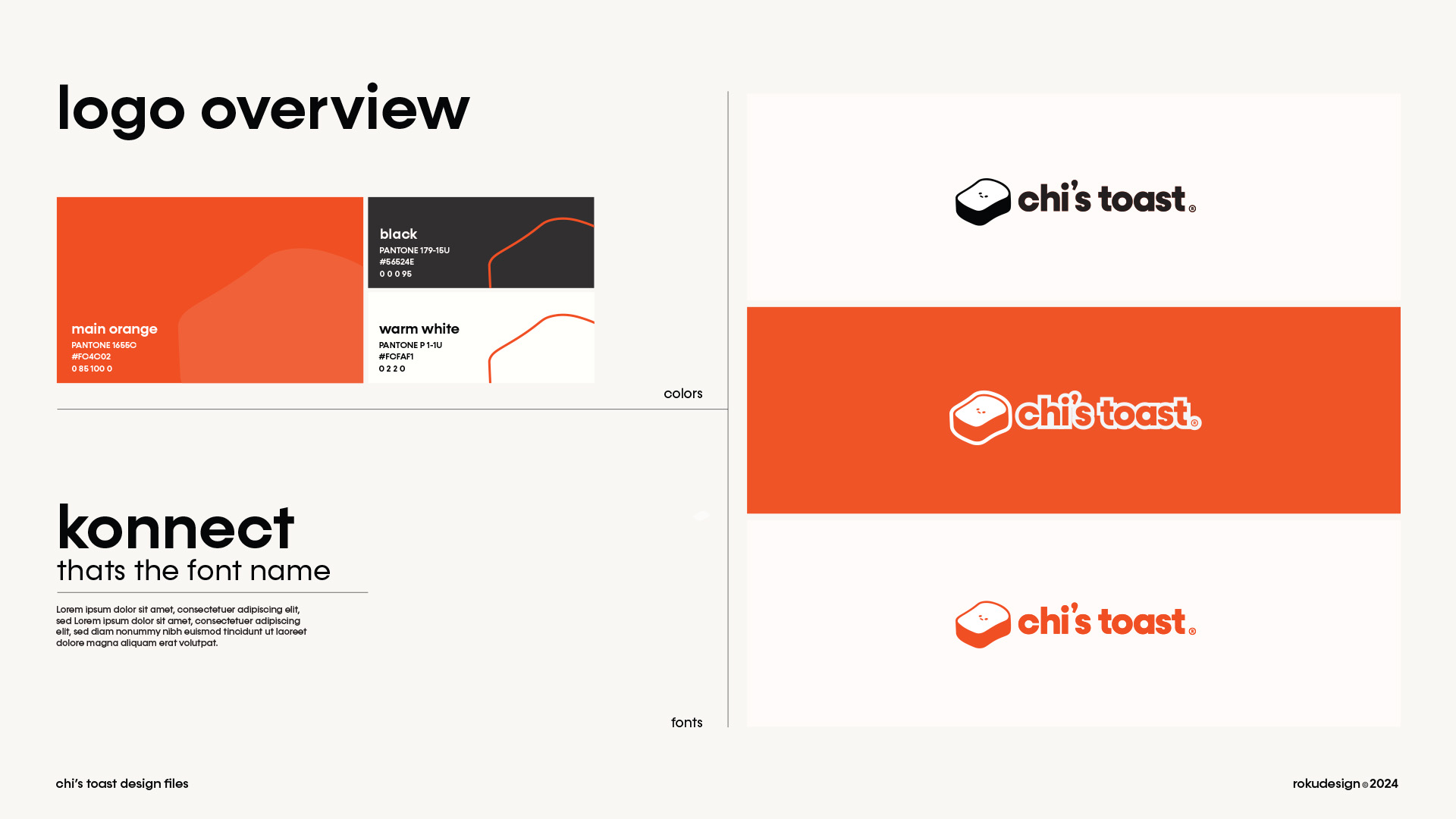
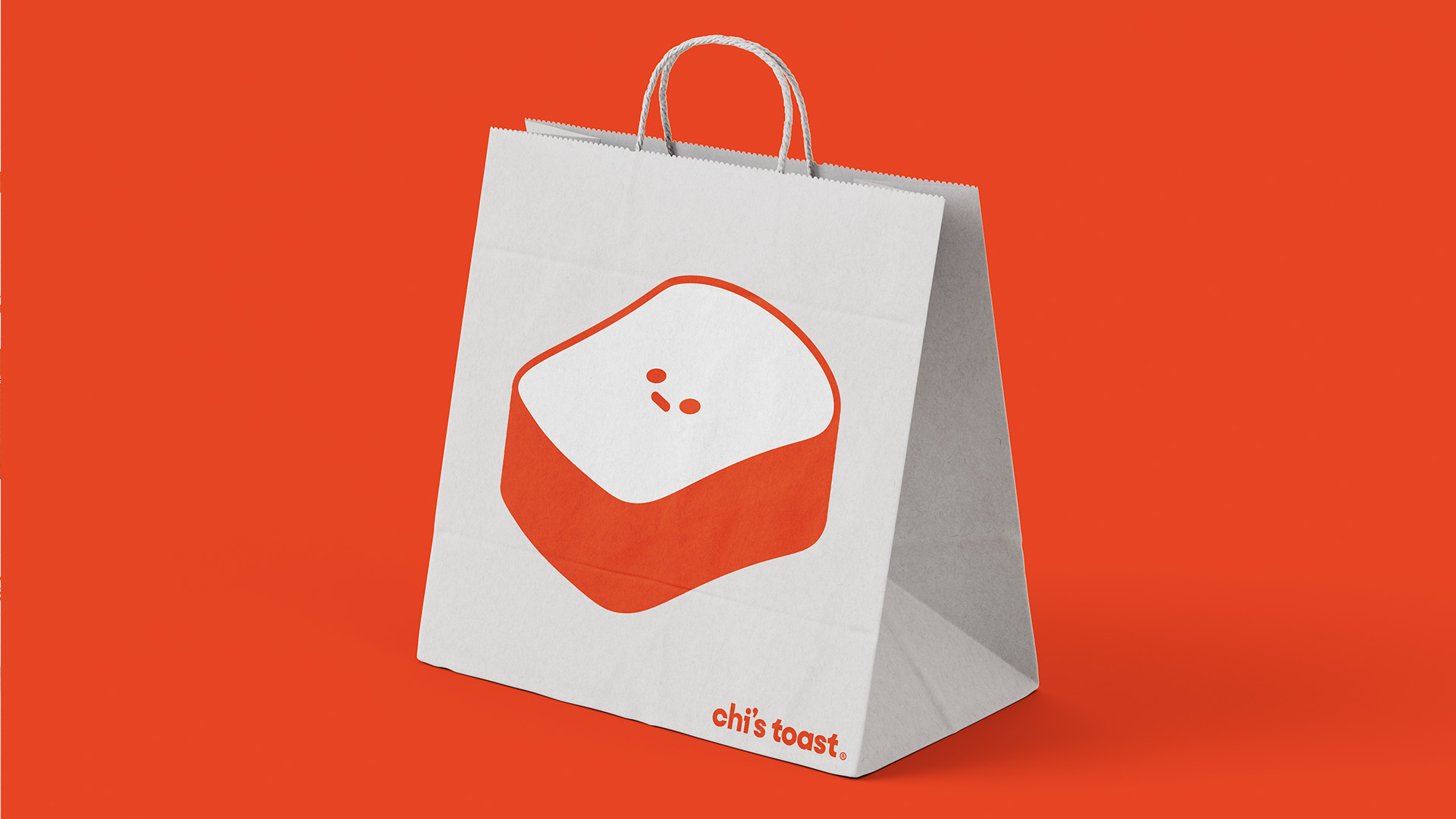
A mascot to represent
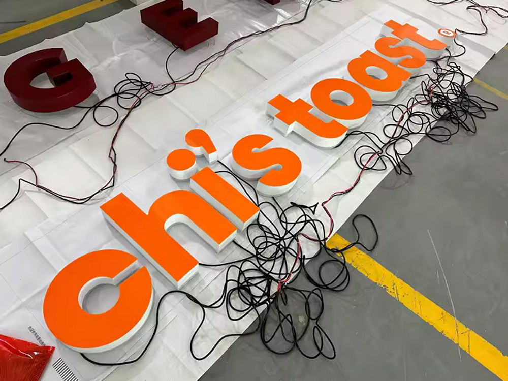
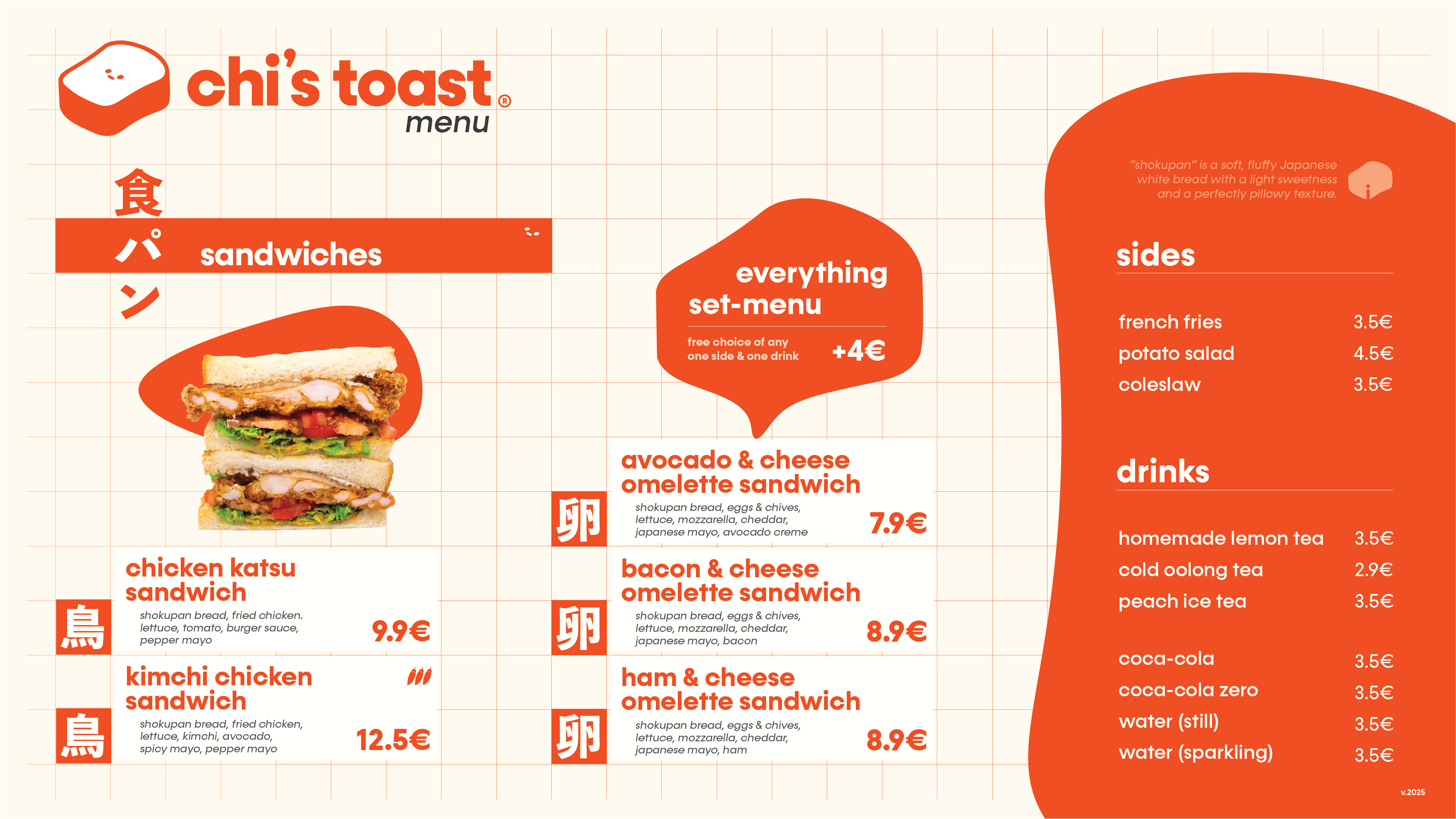
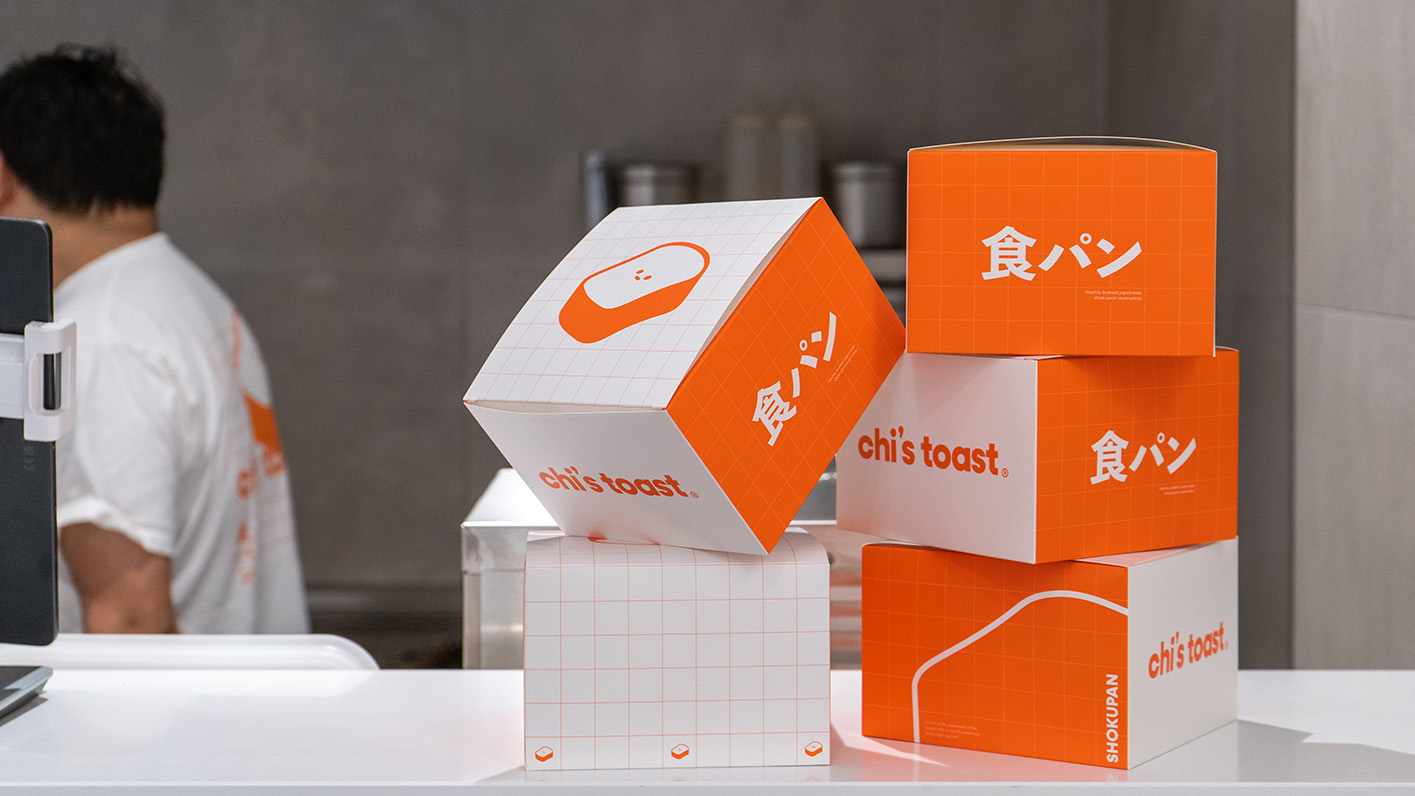
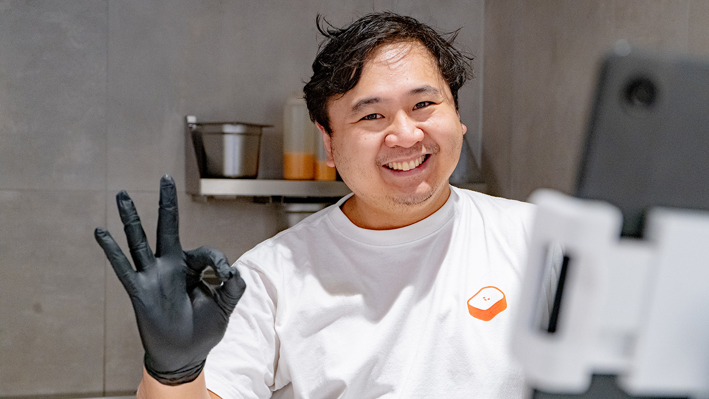
As a way to blend the German environment with the Japanese spirit, the core of the identity consists of a simple typographic logo, amended by a cute expressionless toast-mascot. A majority of the text is German and English for the international audience of the Skyline Plaza clientele, with Japanese keywords that garner curiosity without being confusing.
The colors are warm, fresh and simple, just as the daily freshly baked Shokupan bread.
Interior interludes
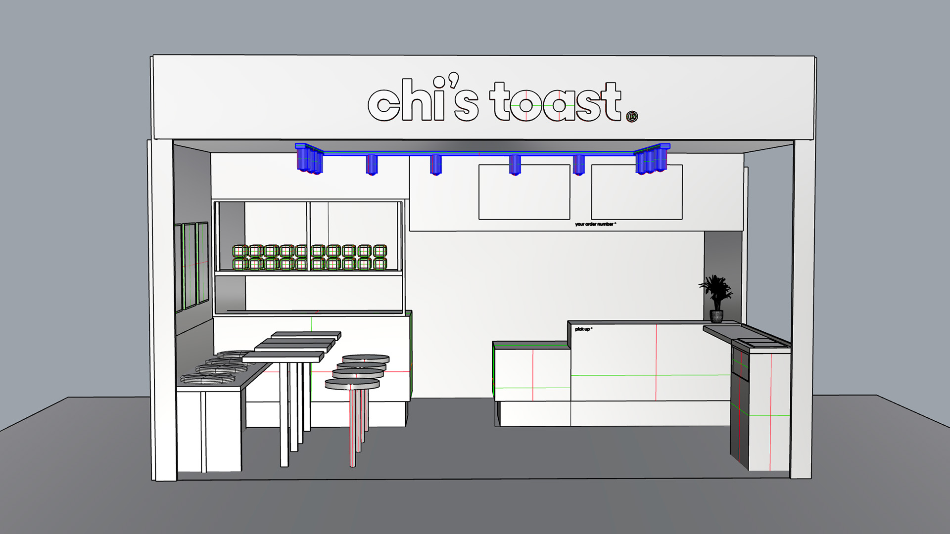
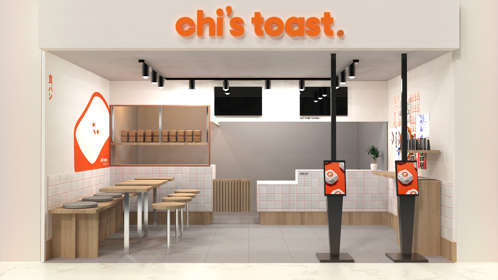
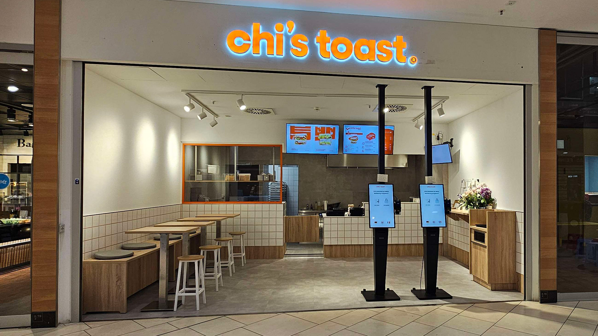
Although it was not part of the initial scope, I modeled up a proposal for an interior design for the shop that ended up actually getting implemented!
As with the overall brand, the owners were looking for a modern fast-food take-out atmosphere. The tiles are universally recognizable as a quick-serve kitchen, while the orange grout adds a touch of the branding elements. This is elevated by the use of oak wood in the furniture, blending the ‘diner’ x ‘Japan interior’ atmosphere.
The window to the kitchen lets passersby see the work being put into the freshly made bread, which is proudly presented just above the prep-station, highlighting the pride the owners take in the shokupan they prepare.
Web, Social and More
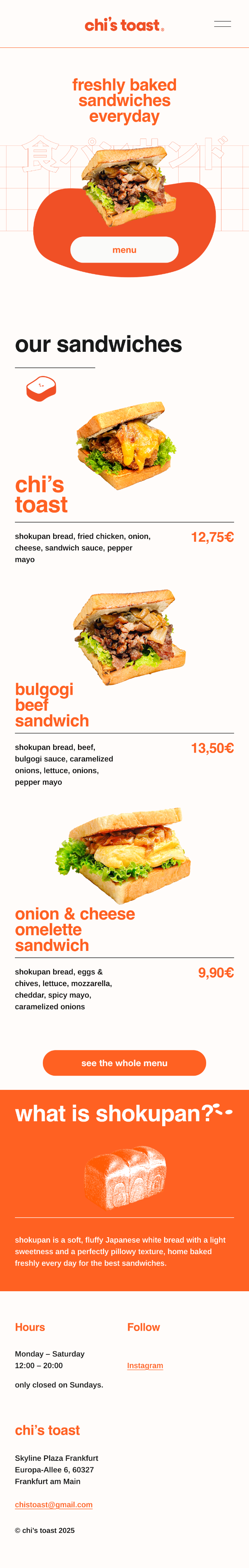
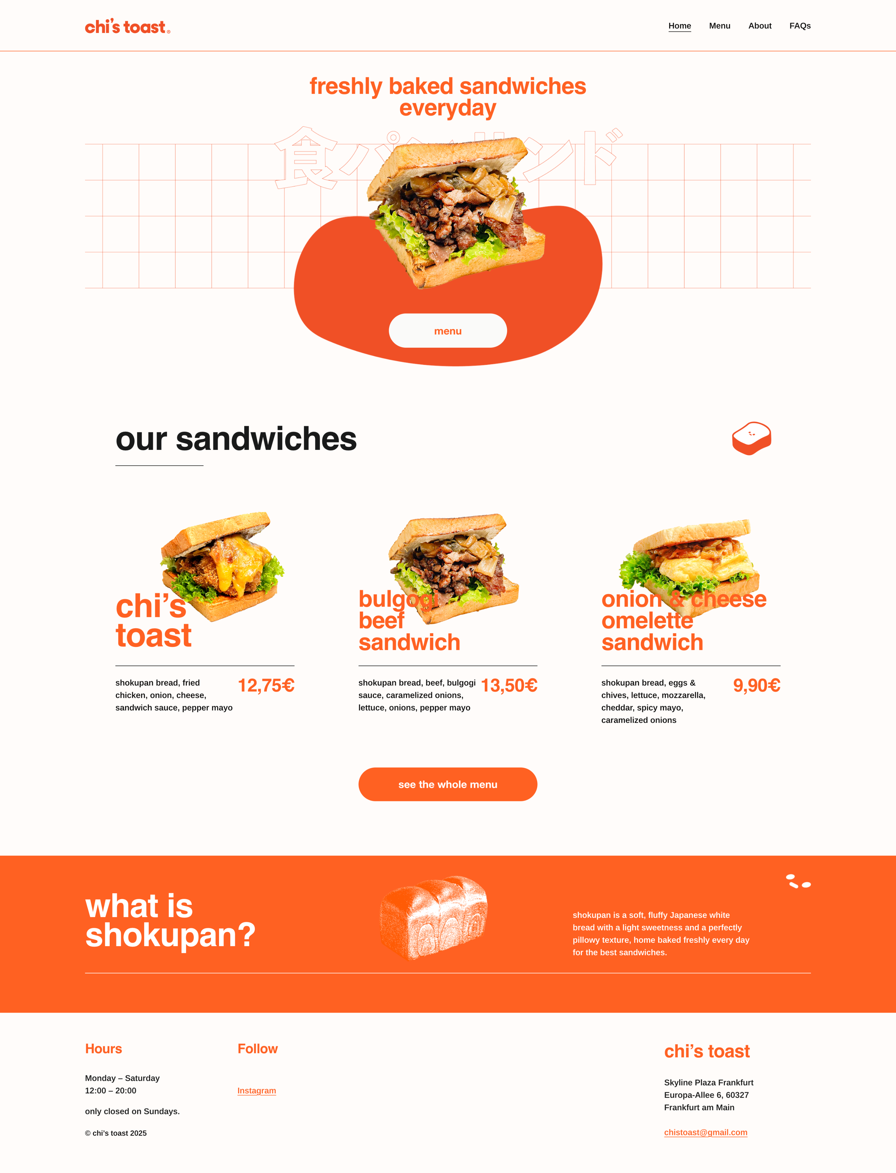
With the overall success of the initial branding, my work also expanded into making a simple website that can be used to check out the menu, and some additional graphic design for promotion and social media.
Want to see more?
Client
chi’s toast
Industry
Service/Food
The creators of chi’s toast reached out to me looking for help initially with creating a logo, which later expanded to working together on their packaging, website, store interior, and more.
With Japanese Shokupan at the center and being located in a shopping mall with a lot of foot traffic, chi’s toast was looking for a brand identity that conveys an elevated fast-food take-out vibe, while keeping the Japanese core identity.
chi’s toast のクリエイターから、最初はロゴ制作のご相談をいただきました。その後、パッケージ、ウェブサイト、店舗の内装などへと仕事の範囲が広がり、ブランド全体を一緒につくっていく形になりました。
日本の食パンを中心に据え、人通りの多いショッピングモール内に店舗を構える chi’s toast には、「少し上質なファストフードのテイクアウト」という雰囲気を持ちながらも、日本らしいコアのアイデンティティをきちんと保てるブランドづくりが求められていました。
A mascot to represent
As a way to blend the German environment with the Japanese spirit, the core of the identity consists of a simple typographic logo, amended by a cute expressionless toast-mascot. A majority of the text is German and English for the international audience of the Skyline Plaza clientele, with Japanese keywords that garner curiosity without being confusing.
The colors are warm, fresh and simple, just as the daily freshly baked Shokupan bread.
Interior interludes
Although it was not part of the initial scope, I modeled up a proposal for an interior design for the shop that ended up actually getting implemented!
As with the overall brand, the owners were looking for a modern fast-food take-out atmosphere. The tiles are universally recognizable as a quick-serve kitchen, while the orange grout adds a touch of the branding elements. This is elevated by the use of oak wood in the furniture, blending the ‘diner’ x ‘Japan interior’ atmosphere.
The window to the kitchen lets passersby see the work being put into the freshly made bread, which is proudly presented just above the prep-station, highlighting the pride the owners take in the shokupan they prepare.
Web, Social and More
With the overall success of the initial branding, my work also expanded into making a simple website that can be used to check out the menu, and some additional graphic design for promotion and social media.
Want to see more?